How we shaped the new face of Prishtina’s public transport
When a city changes the way it moves, it transforms the way it lives. And when the city we’ve called home all our lives needs us, we show up and give our best to create something meaningful.
As the Municipality of Prishtina embarked on a major reform to tackle mobility challenges, a new communication approach and brand identity for public transport became essential. In collaboration with ARUP International, Koperativa designed the creative communication strategy: from naming, to visual identity, to a communication concept that connects citizens with their new transport system.

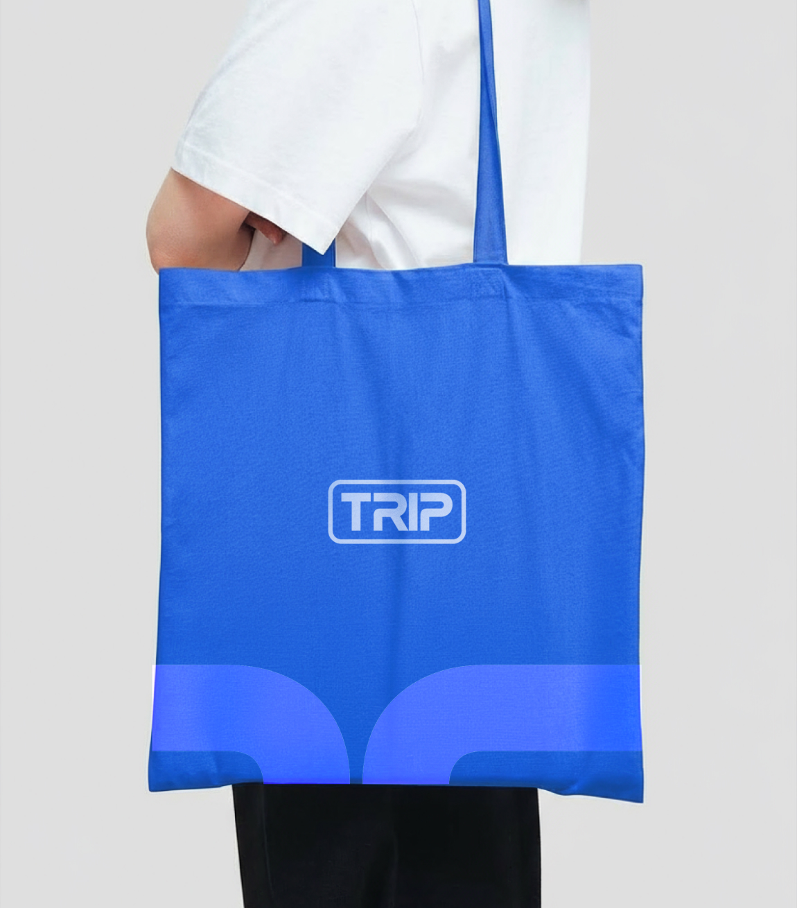
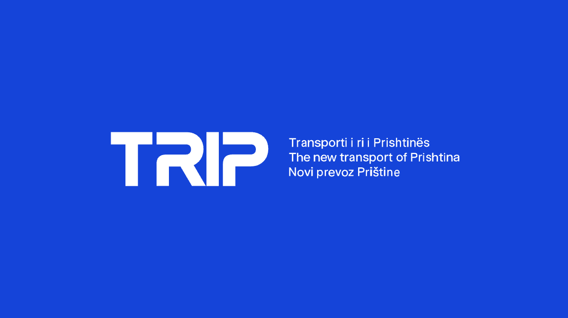
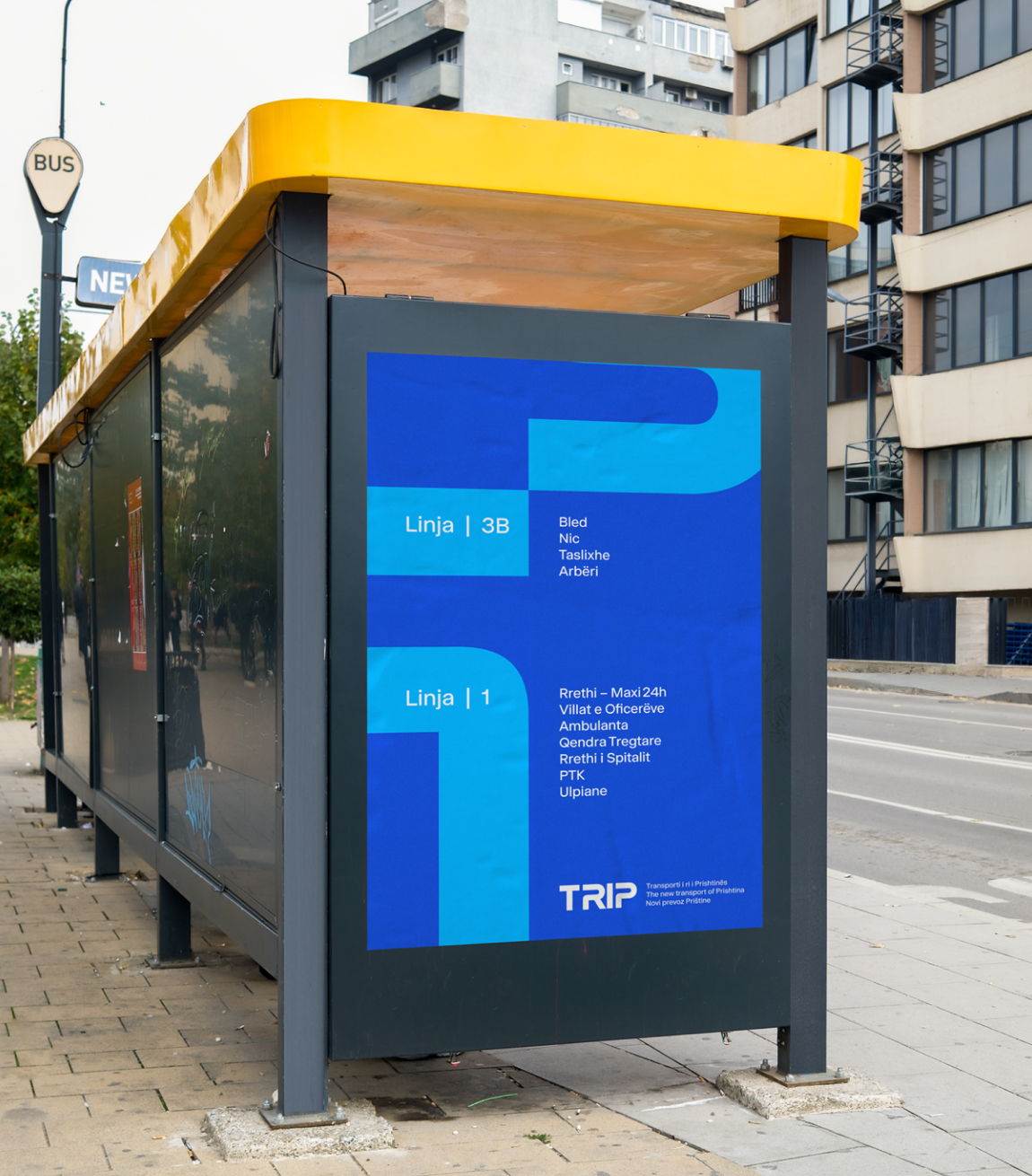
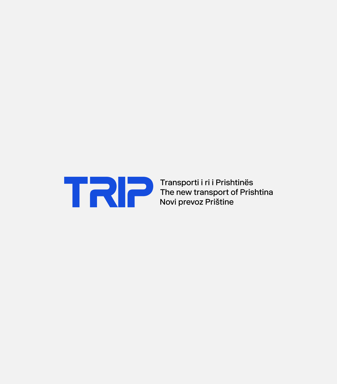
This is TRIP – Transporti i Ri i Prishtinës.
A fresh beginning for Prishtina, built to last. TRIP is a cultural shift, making everyday life in the city easier, more accessible, and more connected.This is TRIP – Transporti i Ri i Prishtinës.
A fresh beginning for Prishtina, built to last. TRIP is a cultural shift, making everyday life in the city easier, more accessible, and more connected.


When we started this project, we looked at two things: the transport and the culture. How do Prishtina’s people think, speak, and dream about their city? What kind of language could invite them to try something new and trust it? And because we’ve spent our lives in this city, we knew the answers wouldn’t come from textbooks.
Some of our team members have lived here since the early ’90s, through the most difficult and uncertain times, watching the city struggle yet survive. Others are from a younger generation, the Gen-Z team, growing up in a Prishtina that is louder, faster, and more digital.
Together, we carry the memories of what the city was, and the energy of what it’s becoming. That mix made creating TRIP feel natural, but also deeply personal. We did it with love and care for the place that raised us. We’ve seen Prishtina transform, and now we are proud to be part of shaping its future.


From these insights, we built a communication strategy around three pillars:
Clarity – making the new system easy to understand.
Trust – rebuilding confidence in public transport.
Adoption & Pride – turning buses into a symbol of a modern Prishtina.
Creating a name that both citizens and the municipality will embrace is never easy. We had to imagine how it would sound out loud, whether it would feel natural in daily conversation, and how it would resonate across generations. Cultural relevance was key. The name also needed to adapt seamlessly on a bus ticket, in an app, or in a headline. Above all, it had to be simple, memorable, and emotionally engaging. Something people would truly want to use.
We created TRIP: both an acronym (Transporti i Ri i Prishtinës) and a universal word everyone associates with movement—a journey, a moment on the move.
From there, we developed slogans that sounded like Prishtina itself: a mix of slang, nostalgia, and playful confidence.
“N’TRIP me ty.”
“Qashtu si dikur, veç ma mirë!”
“Ka zbritje, n’kryeqytet!”
Anyone who grew up in Prishtina remembers the shout “Ka zbritje!”. We brought that memory back and gave it a future. The result was instant recognition—a campaign that feels like it has always belonged to the city.

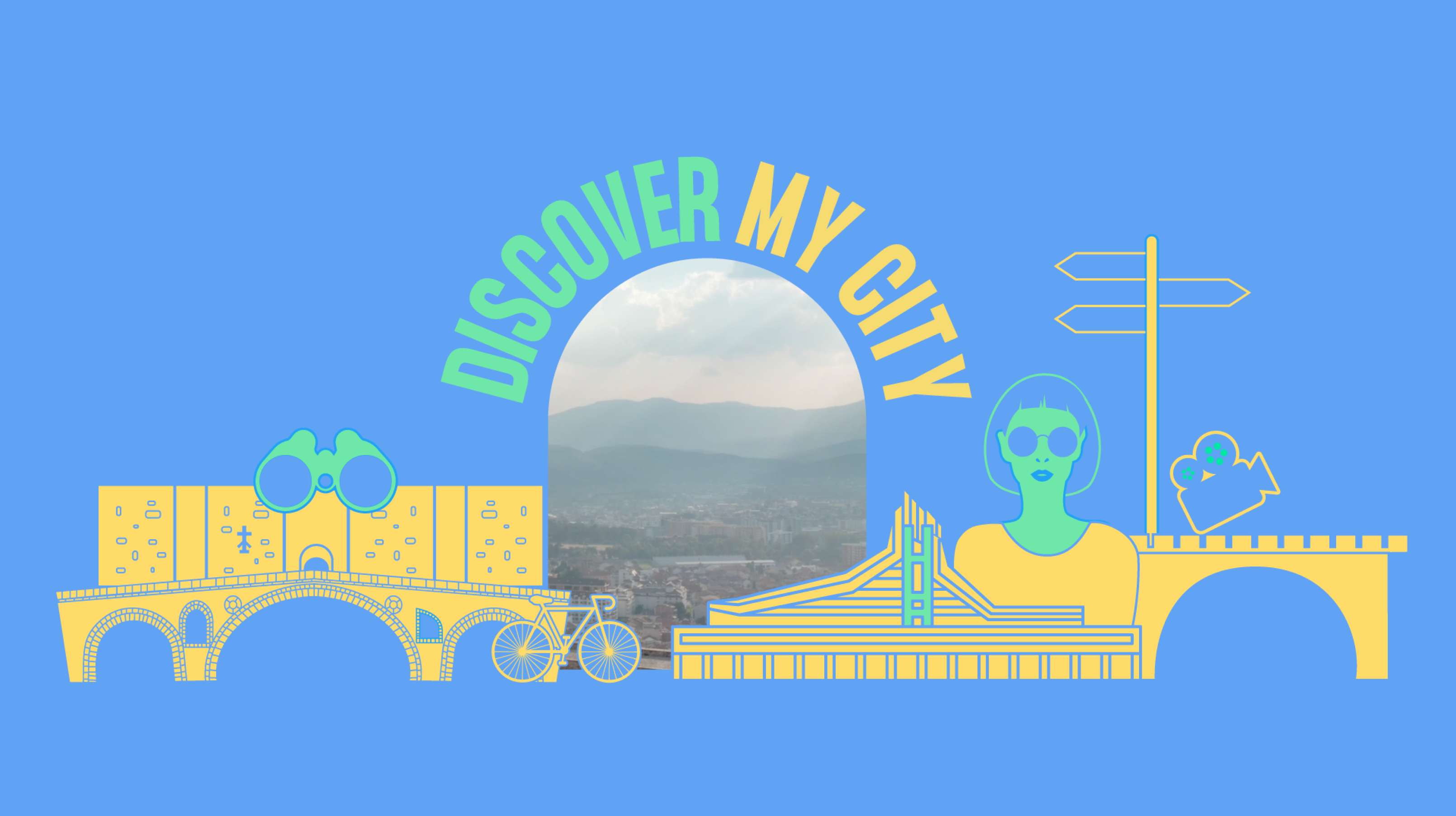
From Strategy to Storytelling
A plan only works if people can connect with it, so we turned strategy into a story that moves.
Teaser: We started with a short, minimalistic but vibrant teaser animation. Intriguing, fast-paced, and full of motion, it sparked curiosity and hinted that something was about to change.
Main Animation: Then came the 50-second animation where TRIP itself came alive. Neighbourhoods connected, icons and emojis danced across the screen, and citizens saw themselves in a system designed for them.
Identity: Together, these pieces created a playful, “trippy” visual world that gave TRIP an identity — one that felt as dynamic and vibrant as Prishtina.